Operations Panel Overview
With Operations Panel, you get all the data you need in a single dashboard, so you can quickly figure out how your branch is performing. For example, you can:
see information about the wait times in a branch
see detailed information about the different queues such as number of customers served, number of no-shows, average wait time etc.
find, transfer and remove visits
see the performance of service points
change the work profile for a staff member.
To open Operations Panel, go to Monitor Operations in the left menu.
When you open the Operations Panel, you see data for the whole organization (enterprise view). To see data for a specific branch only, select that branch in the Branch Summary.
At the top of the page you see some graphs. Which graphs you see depends on the settings for your system.
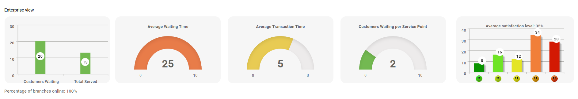
Until a branch has been selected, the graphs show data for the whole organization. The colors of the meters indicate how well your organization is meeting the service level.
Below the graphs, you see a summary of all branches if your organization has more than one branch. You also have the Appointment Summary tab where you can see the number of appointments for today per branch.
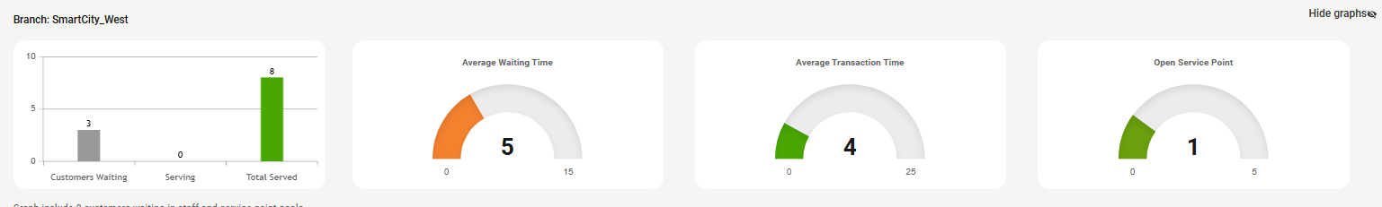
If you select a branch from the list of branches in Branch Summary, you get access to the tables which show detailed data for the selected branch. Which tables you see depends on the settings for your system, but it's usually some of the following:
Queue / Service Point Summary
Queue Summary, where you see data per queue
Service Point Summary, where you see data per service point
NPS, where you see the NPS score of the branch.
Webcam, where you can see a real-time view of your waiting area if you have set up a webcam for streaming.
Change threshold settings for graphs
Depending on the settings for your system, you might have the possibility to change the threshold settings for graphs and other SLA values. This is done in General Settings > Threshold Settings.
The graphs on the top of the dashboard, and also some SLA indications in the tables, are affected by these settings:
You can change the settings for the following metrics:
Waiting Time
Appointment Waiting Time
Transaction Time
Open Service Point
For each metric, you can change the following settings:
Green shown until - sets the time limit for when the meter changes color from green to amber
Amber shown until - sets the time limit for when the meter changes color from amber to red
Max value for graph - sets the maximum value of the graph
For number of open service points, you can instead set Red shown until and Amber shown until.